Taking mindful, effective breaks is a key part of staying productive throughout a full day of work.
We’ve all picked up our phones seeking a quick distraction, mindlessly scrolling through social media. This often leaves us feeling less refreshed than when we began. What if there was a simple alternative that could steer us towards healthier, mindful breaks that help us build momentum & work towards long-term goals?
SmartBreak is a case study exploring what a user flow for taking better breaks could look like.
Project Goal
Create a web app that helps users take breaks that leave them feeling inspired & help achieve their long-term goals
My Role
UX Designer & Researcher
EMPATHIZE
Initial Research
I initially conducted 5 in-person interviews and created empathy maps to understand the needs of users I’m designing for. The primary user group identified through research was remote workers adjusting to new working conditions. 100% of study participants reported feeling frustrated with low-quality breaks, and difficulty returning to work in a timely manner after taking a break.
This research suggested two key features for SmartBreak: including features that specifically allow users to choose high quality breaks, and including a timer so users are prompted to return to work after a set break duration.
DEFINE
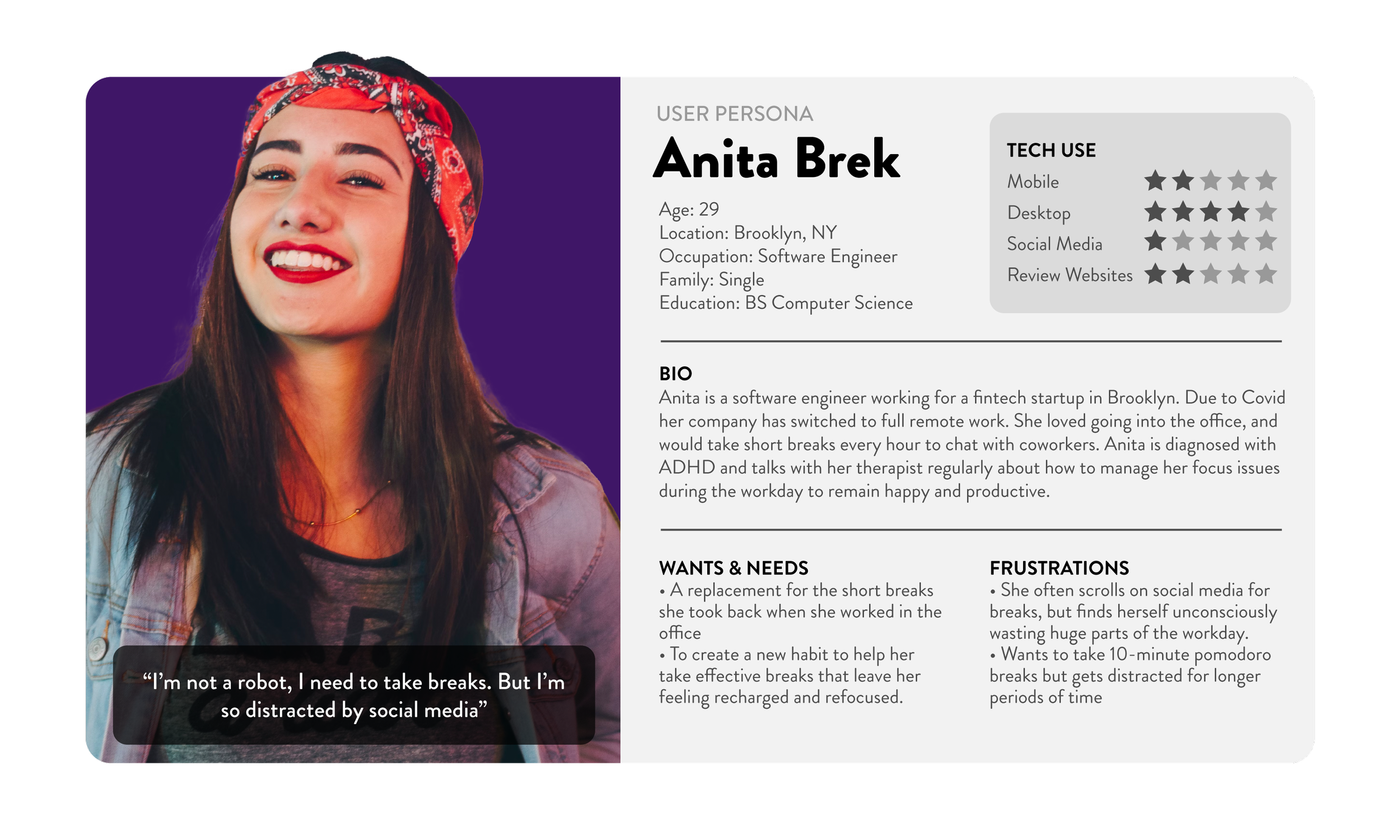
User Persona
I crafted a user persona to represent key themes gathered during initial research.
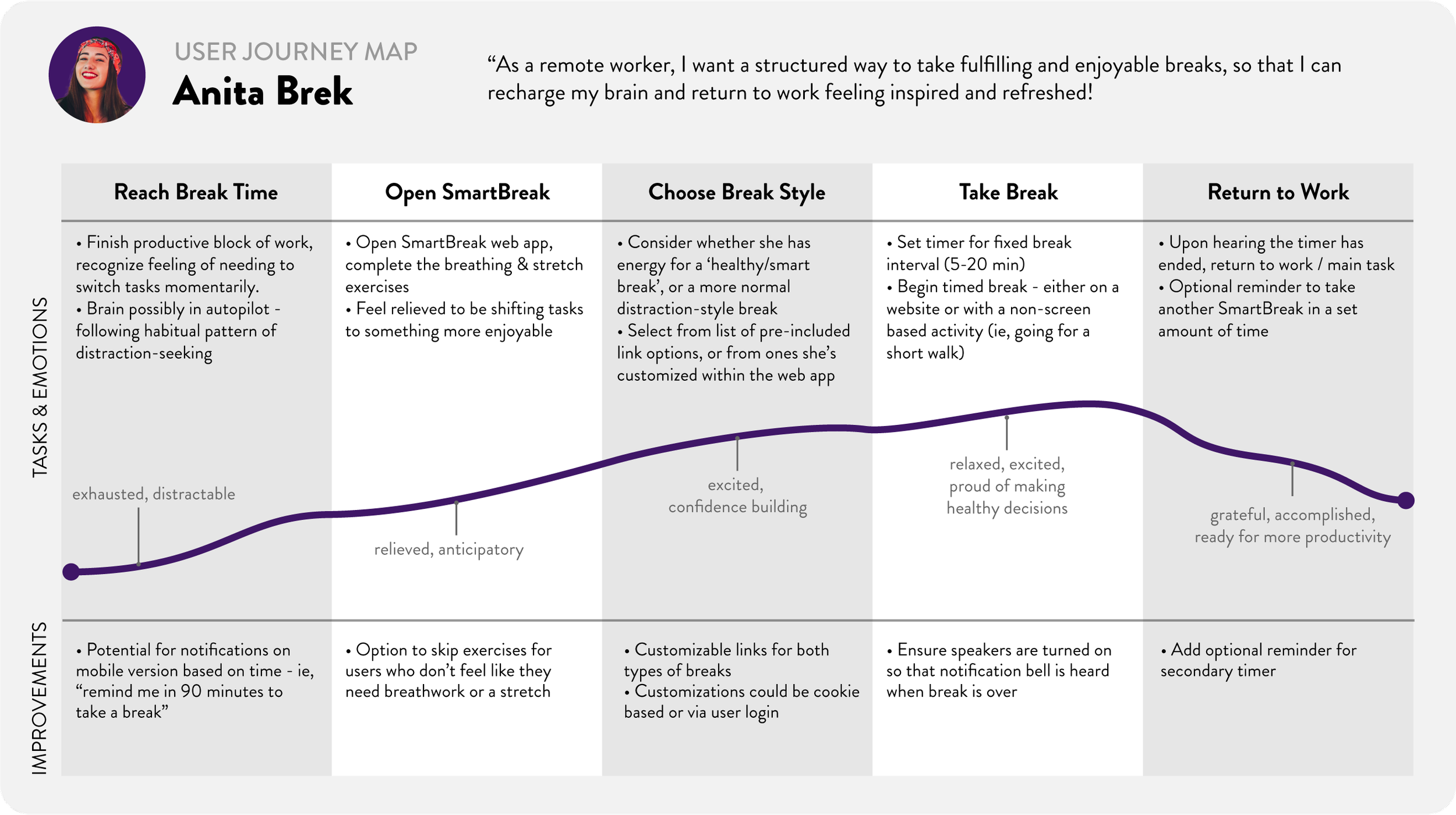
User Journey Map
IDEATE + PROTOTYPE
Concept Development
I first created a site map to get a basic idea of the user flow through the product.
I then sketched out rough paper wireframes and built a low-fidelity prototype in Adobe XD for user testing.
REFINE + HANDOFF
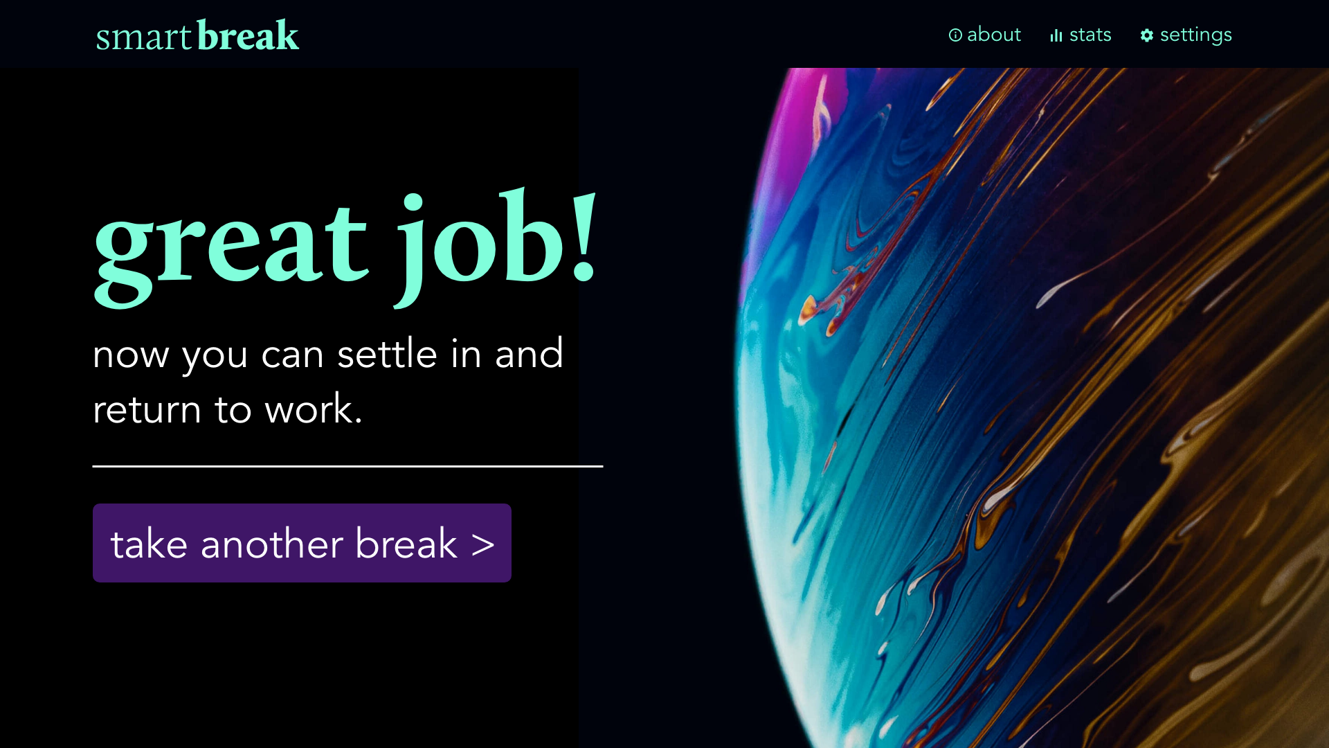
High Fidelity Screens
Based on a short peer-focused usability study, I developed a high-fidelity prototype for additional testing.
Final Prototype
See below for the embedded XD prototype, prepped and ready for handoff to developers.
CONCLUSION
This project was critical in expanding some of my more technical skills in Adobe XD, as well as learning some key takeaways:
Simulating animations in high fidelity prototypes really helped users engage meaningfully with the prototype. It’s a little bit of extra effort but it’s worth it!
Designing web apps for use without login is a great way to make a product quickly accessible for all users


